
Colour in Art
Sep 21, 2022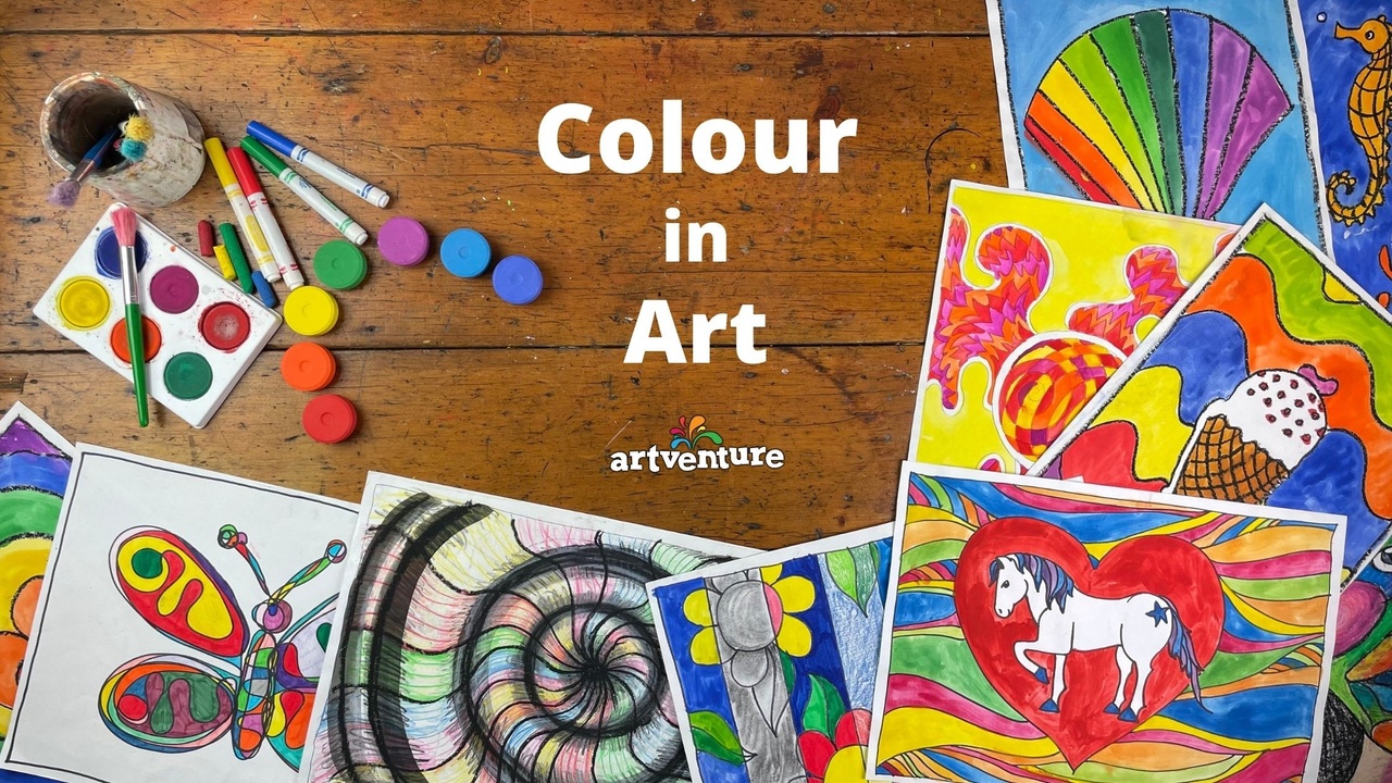
As children start to pick up pencils, crayons and paint brushes they delight in changing colours. Becoming more proficient with their artworks, increasing awareness of what colour is and how to manipulate it to suit their purposes and feelings is something we can help them with.
One of the first things we often teach our young ones is colours - the yellow banana, the red fire engine, the green grass, the blue sky. We talk about our favourite colours which are often connected with things we like or the way they make us feel. I like green because it reminds me of nature. Some like yellow because it is a bright, happy colour. Certain colours can be used to represent feelings - red for anger and frustration, orange for courage and confidence, yellow for joy and happiness, green for calm and peace, purple for worry and fear, blue for sadness and hurt, pink for warmth and love.
Rainbows light up a dark sky and brighten the moment. The sun shines and colours bombard our senses. Clouds appear, the sun sets, darkness descends and colours dissipate.
So, what is colour?
Colour is the reflection of light. When the rainbow of wavelengths which make up light hits an object, colour that is not absorbed is reflected and that is what we see. Light hits the surface of an orange and every colour except orange is absorbed - orange is reflected and that is what we see. Black objects absorb all the colour and reflect none whereas white objects reflect all the light. The colours of the rainbow (those wavelengths in light) are red, orange, yellow, green, blue, indigo and violet. To remember these in order, I use the classic mnemonic “Richard Of York Gave Battle In Vain” but there is also just “ROY G BIV” or you could make up your own.
The primary colours are red, yellow and blue. All other colours are created by mixing these. There are secondary colours - orange, violet and green - produced by mixing two of the primary colours. Tertiary colours are created by combining one primary colour and the closest secondary colour - like a blue green. Complementary colours are opposites - if mixed they cancel themselves out and create a greyscale colour or black. But used alongside each other they create bold, high-contrast effects. Examples are orange and blue, yellow and purple, red and green. Then we have warm colours - mixtures of red hues, and cool colours - mixtures of blue hues.
Terminology you might hear or use like hue, tone, tint and shade tend to be interchangeable with the word ‘colour’ in our general conversations. But it is interesting to note there is a definite distinction between these in the painting world - whether painters of structures or creators of paintings. This differentiation can be used when determining methods of creating new colours for use in artworks. Hue refers to a pure, primary colour. A Tint is created by adding white to get a lighter, brighter version of the colour. Using grey (pure black and white mixture) to change the Tone of a primary colour results in a duller, sometimes more subtle colour. By adding just black to an original hue, you get a darker more intense Shade of the colour.
In the Visual Art world, COLOUR is one of several elements that can be used when composing an artwork. Others include things like line, shape and texture. For artists, TONE can be another visual element and refers to the lightness or darkness of a colour. This is also referred to as the value of the colour. Saturation of a colour refers to its intensity or richness - a bit like ‘tinting’ it with white and changing the ‘tone’ with greys or the ‘shade’ by adding black.
How is colour used?
Artists capture the essence of our world with artworks reflecting, portraying and evoking emotions. Colour is a building block to composing an artwork. Choices and techniques used by the painter are based on their perspective, what they see and feel. Colour portrays mood and sets an atmosphere. Tone can be used to create contrasts and shadows, depth and distance, and a sense of drama. Artists also experiment with creating gradients with gradual blending of colours.
How people view artwork is influenced by their own colour story - the colours they are drawn to or shy away from, based on life experiences. Our own moods, likes and dislikes can be swayed by colour. When you look at the Artventure lessons, colours used in the artworks vary enormously. When you are choosing a lesson, reflect on whether your choice is influenced by your mood. Do the colours in the artwork mirror how you are feeling in any way? Or perhaps you’d like to modify and change the colours in the artwork so it does match how you are seeing things at this moment.
Artworks are a creative outlet for us to express our emotions, with colour being the strongest visual element. You might like to show your children more about how to develop skills in playing with colours so they can make their artworks more meaningful for themselves.
Learn some kids art tips and tricks from the Artventure Library
- Mixing colours - creating different shades and tones by mixing watercolors on coloured discs in the palette then cleaning them
- Blending colours - creating gradient effects by mixing colours on the paper during the painting process
- Oil pastel and watercolour paint - ways to ensure colours are clean, bright and strong
- Using markers - how colours mix if using water-based markers
- Stylised Figure - an example that demonstrates blending oil pastels
- Donut Ripple - a lesson using coloured pencil shading and blending
- Contrast - simple techniques to make pictures stand out more
Learn to draw and paint more from the Art Eye Deer Library
- Colour wheel - pencil (blending techniques)
- Colour wheel - paint (creating and expanding colour options)
If you’d just like to review your collection of art supplies, try this link to the Materials page.
Whether you are a classroom teacher, homeschooling or entertaining kids on a weekend, developing an awareness of colour in artworks can help children express their feelings better. That release of emotions through creativity with colour can be cathartic, cleansing and therapeutic. Our little artists cannot always tell us how they feel but their paintings and drawings can be very revealing. As the sun shines, colours become more vibrant and our world seems a brighter place. Today, let’s bring out those warm colours!
Access to the art lessons mentioned above can be found in our online library of video art lessons for kids, sign up here!
Erica
Teacher and Artventure Blogger
